
Surprise!
I'm also interested in teaching and sharing my thoughts about UX, visual design, micro-interactions, and design in general.
I'm also interested in teaching and sharing my thoughts about UX, visual design, micro-interactions, and design in general.


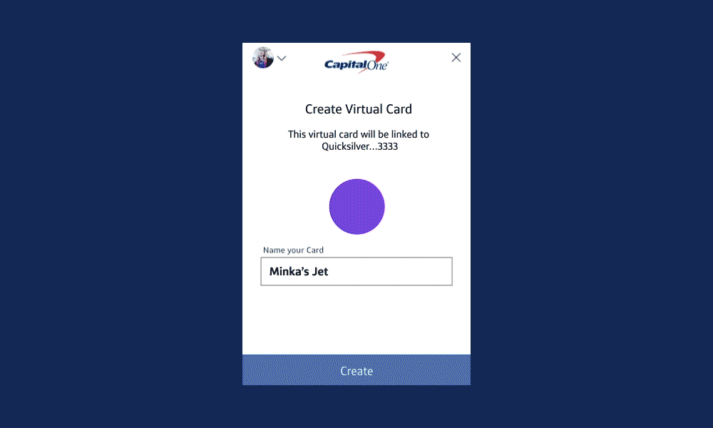
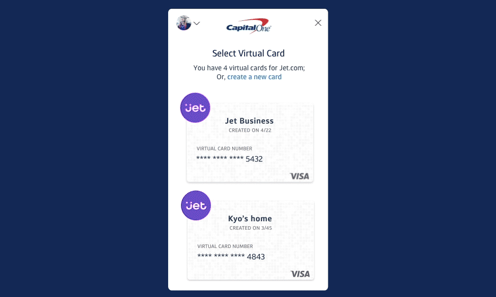
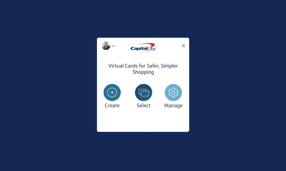
Capital One is utilizing its virtual card numbers-a form of security wherein a bank issues a one-time digital card for purchases-to protect against hackers and other forms of online fraud. Since it's not a familiar idea and concept for the users, we needed to come up with something that can help them understand what's happening and what they can do.

My senior leaders gave me a mission to solve a big problem before Eno's launch in March of 2018. I led the design of the interaction flow and patterns related to UI animation. I worked with 1 product manager, 2 developers, and 3 designers on the project. After defining the problem statement, I stepped back to see the whole picture of the flow and map to develop an experience. One of the challenges for this project was the short timeline, so I had to come up with a well-planned design roadmap to test and ensure the success of our interaction flows while also saving time.
Finding and defining the problems was the most challenging for us because of the vague descriptions pilot users gave us about the content being 'confusing.'
I worked with a design manager and a developer to create the roadmap to make sure we solved the problem and delivered it on time.
I developed the interaction flows and patterns, complete with a micro-interaction plugin for web.
Eno's pilot users loved the idea of protecting their card number from fraud by using virtual numbers, but they often got confused about how they worked. For example, when they created a virtual number on a merchant's website, they didn't understand that the virtual number is linked only with that particular merchant. They thought they could use that same number on other website as well. Our goal was to eliminate this confusion and improve the customer experience in delightful way. We believed that micro-interaction could help the user understand what's happening during the virtual number creation process, and what happens in the event of fraudulent charges.
We ran testing with more than 30 internal and external users to learn what they were struggling with related to virtual numbers and fraud reporting. After successfully completing motion studies to create the right UI animation, we were able to finalize the interaction and transition model. With the updates, there is significantly less confusion from users surrounding the idea of virtual numbers.
Plus, It has been launched successfully in March 2018 on the public. So all the Capital One customers be able to use it now! It's also featured on Tech Crunch, Business insider, and many.
Because of the confidential nature of the work, I can't publicly share artifacts from my design process, but I'd be happy to show them to you in person if you'd like.
Feel free to reach out.