
Surprise!
I'm also interested in teaching and sharing my thoughts about UX, visual design, micro-interactions, and design in general.
I'm also interested in teaching and sharing my thoughts about UX, visual design, micro-interactions, and design in general.


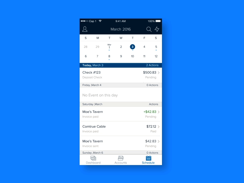
Spark Business from Capital One helps small business owners bank securely-anytime, anywhere. Small business owners can check balances, deposit checks, transfer money and pay bills with the Android and iPhone apps (plus a web version). They can also visualize transactions in a calendar format to manage bills, invoices, and transfers.

When I was a design intern, I was challenged to find something that needed improvement in the Small Business app. While analyzing the product, I realized that the "Schedule" feature (for bills, transfers, and invoices), which was visualized on a calendar, needed some work. Small business owners loved the feature, but the calendar's horizontal scroll interaction was confusing and the ability to add events to the calendar was clunky. I worked with 2 product managers, 5 iOS developers, 5 Android developers and 1 designer, who was my mentor. After putting together an interaction study and list of suggestions for improvement, complete with my recommended UI and motion pattern re-design, I influenced all parties involved that it was the right direction for the experience.
I revisited the strategy and vision to understand how the schedule feature is used for small business owners.
We tested the current schedule flow with 10 small business owners to create a customer journey map. Throughout the process, we defined problems with flow, interaction, and copy. Among them where the calendar's horizontal scroll interaction and the ability to quickly add events to the calendar.
I worked with two product managers to set up the roadmap of this project. We aimed to publish it within 6 months
I redesigned the UI flows and micro-interactions related to the calendar feature for both the Android and iOS apps.
Overall, most of our users appreciated the ability to see their transactions, bills, invoices, and transfers in a calendar format. Some users even said that they wished other banks had this feature. Although people liked the calendar view, there were a few improvements to the UX that were needed to make it the ideal feature. Here, I'll talk about 4 different UX improvements, including converting the calendar scroll from a horizontal one to a vertical one and increasing screen real-estate by shrinking the calendar to a 2-week view when users scroll through their transactions.
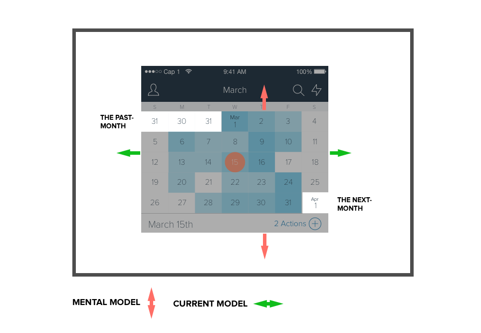
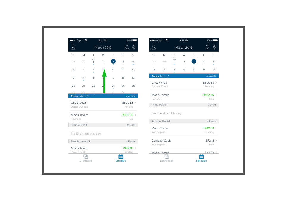
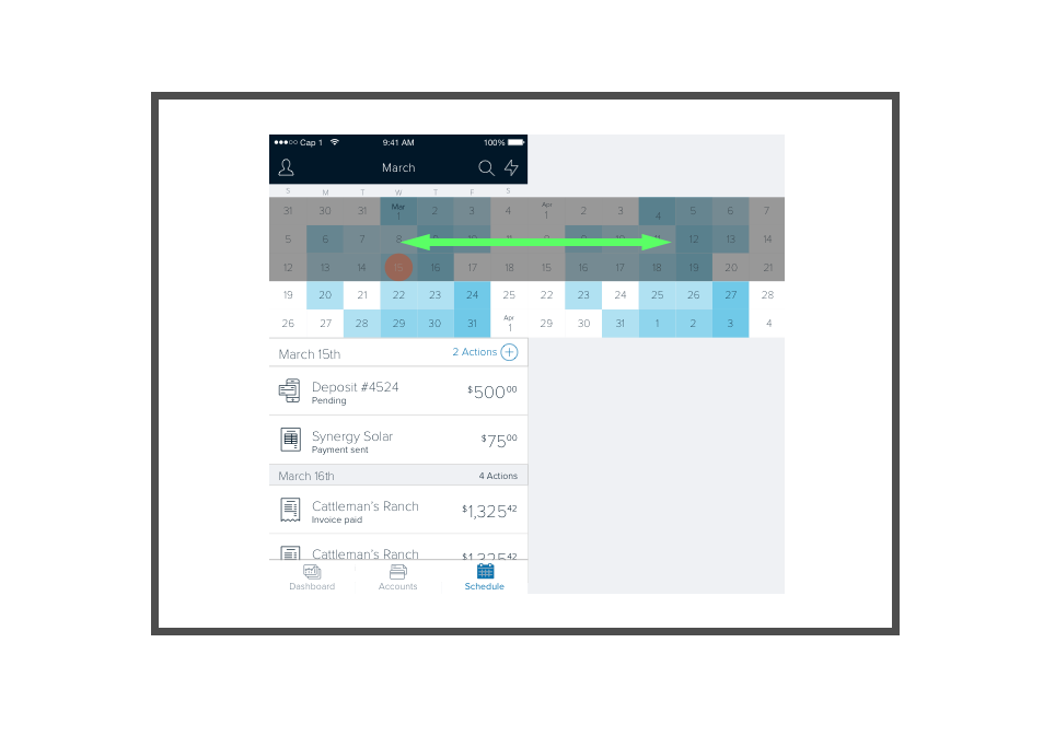
While doing research and internal testing I noticed that testers initially tried to swipe to up and down to change the month view and, only when that didn't work did they swipe right. Most people's mental model of calendar is a vertical view, likely due to the fact that the first few days of the next month can be seen in the last week's row.
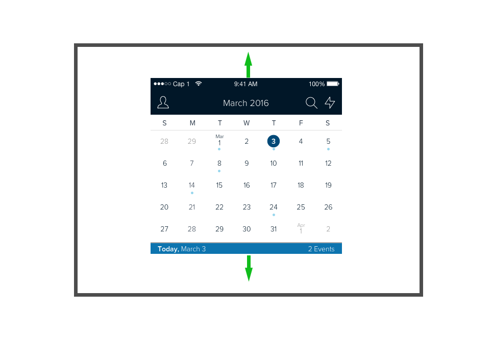
I redesigned the calendar to have a vertical scroll, which better matched people's mental model and also helped them orient more quickly as far as the dates between months go.
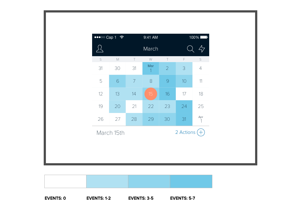
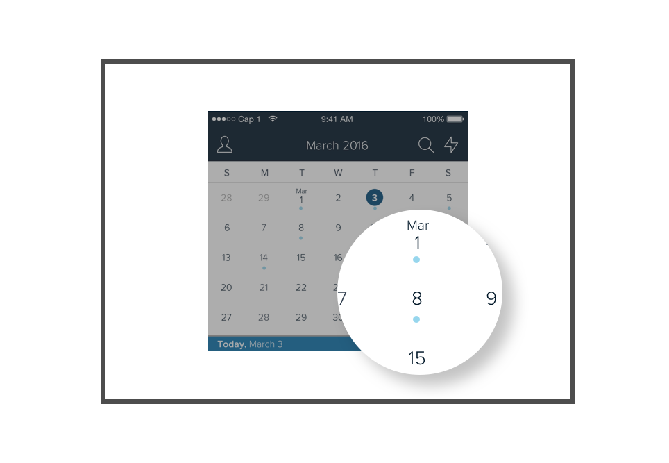
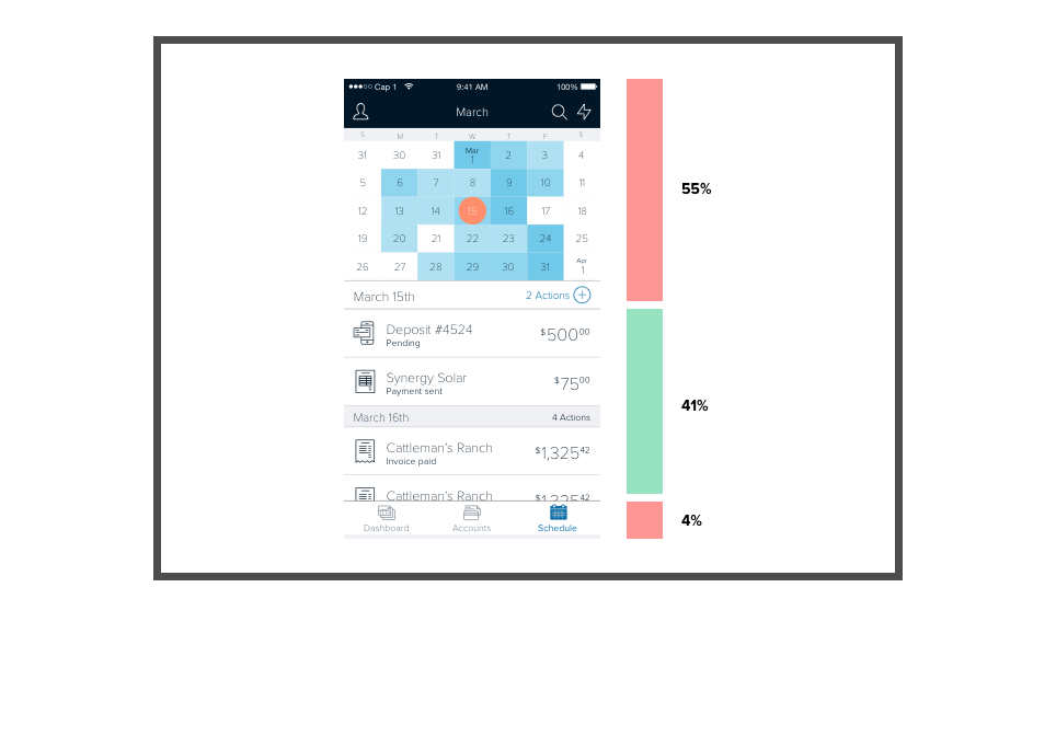
In the original design, different shades of blue were used on the calendar to represent the number of financial events (including scheduled bills, invoices, transfers) occurring on a given day (i.e. white meant no events and a dark shade of blue meant a lot of events). What we discovered is that small business owners only care whether there is an event scheduled or not, and not the quantity of those events. Furthermore, one user we showed this original calendar to didn't understand what the different shades of blue meant in the first place. My solution was to take out the background shading, and instead only include a dot on days when events were scheduled, and display no dot when no even was scheduled. Not only did this simplify the UX for our users, but it also helped the app maintain a cleaner visual design.
The calendar is, without a doubt, helpful for our users to track their financial transactions and events by date, but the calendar takes up more than half of the screen real-estate when the user wants to focus on the list of transactions. Additionally, I realized that most months use 5 rows to display all the dates that fall in the month, but some months need as many as 6 rows, depending on where the first date of the month falls and if the month has 31 days. If a particular month's view uses 6 rows to display all the dates, that means the list view is allotted even less screen real-estate. My solution was to have the calendar shrink down to a two-week view as soon as the user scrolls on the transaction list.
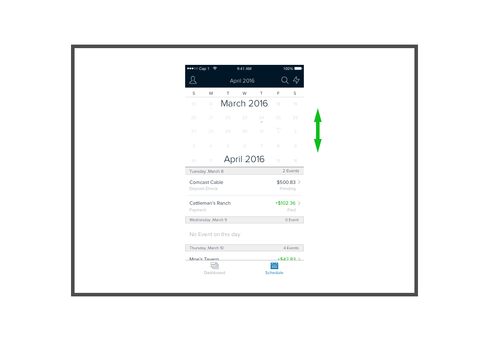
In the original design, there's a bit of a disconnect between the calendar view and the current month when users are scrolling through months. This is probably due to the physical separation between the title of the month displayed in the menu bar and the calendar itself. Other than that, the month can only be guessed from the tiny view of the first 3 letters of the month written above the first day of the month. To solve this, I added a large month title on top of a translucent white background over the calendar when a user scrolls between months. In addition, I left the default size of the month to be 5 rows when a user continually scrolls between months, and only let it expand to a larger height upon release if the month happens to require more than 5 rows.
I used this short video, which I created in AfterEffects to show product owners and developers the new design feature updates to the app.(coming soon)
Due to my diligent UI pattern calendar research and recommended design updates, I was able to get the entire small business team on board with these UX improvements. The final calendar implementation updates were a huge success, and small business owners continually commented on the ease-of-use of the schedule feature in the app.
Because of the confidential nature of the work, I can't publicly share artifacts from my design process, but I'd be happy to show them to you in person if you'd like.
Feel free to reach out.