
Surprise!
I'm also interested in teaching and sharing my thoughts about UX, visual design, micro-interactions, and design in general.
I'm also interested in teaching and sharing my thoughts about UX, visual design, micro-interactions, and design in general.


We recently launched tagging for Google Analytics for all our café Explore screens (the three tall interactive screens seen here), so we know the number and length of screen interaction times, specific content people are engaging with, time of day, etc. After a few months of data collection, we realized that the calendar component was the one with the least amount of interactions from customers (on average, 6 people tap it per day). Yet, at the same time, many people complained about not being able to find information about café events.
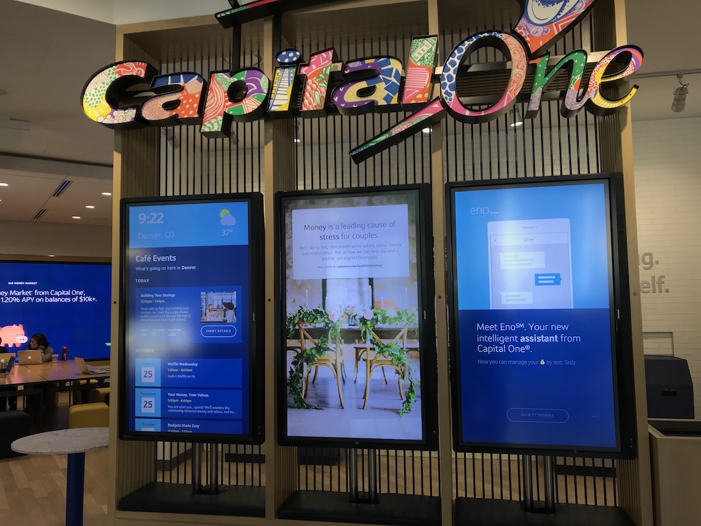
We recently launched tagging for Google Analytics for all our café Explore screens (the three tall interactive screens seen here). With that data, we now know the number and length of screen interaction times, the specific content people are engaging with, the time of day, etc. After a few months of data collection, we learned quite a few things: 1. That people weren't interacting with the Explore screens very often, 2. People especially weren't interacting with the calendar component displaying café events - it had the least amount of interactions from customers (on average, only 6 people tapped it per day). Ironically, however, many people complained about not being able to find information about café events. Obviously, there was a problem here. We decided to focus our efforts on understanding the problems surrounding the event calendar content piece of the Explore screens and make design improvements from there.
I started with this project in July of 2017, and the Explore screen updates were launched in December of 2017. To kick the project off, I dug into the problem of why our customers didn't interact with the Explore screens in the first place to improve the experience.
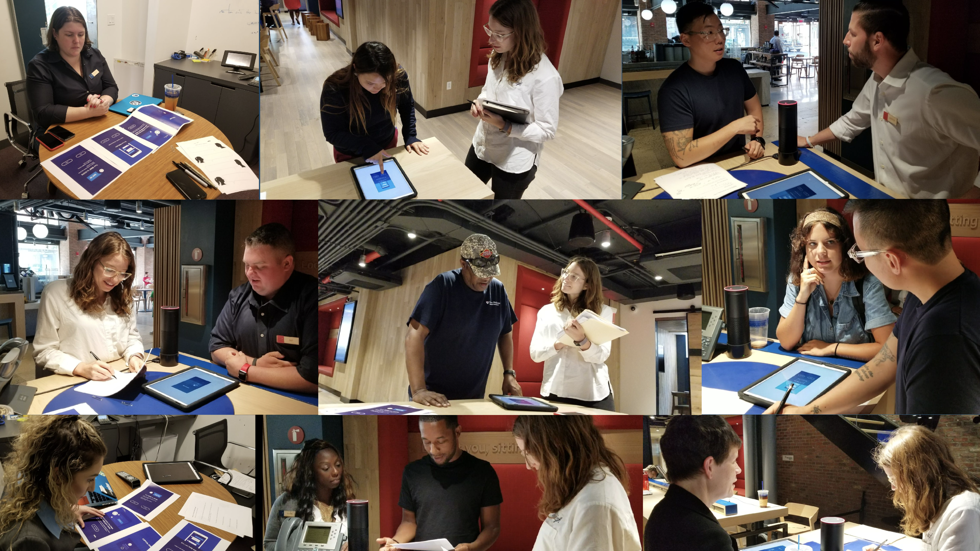
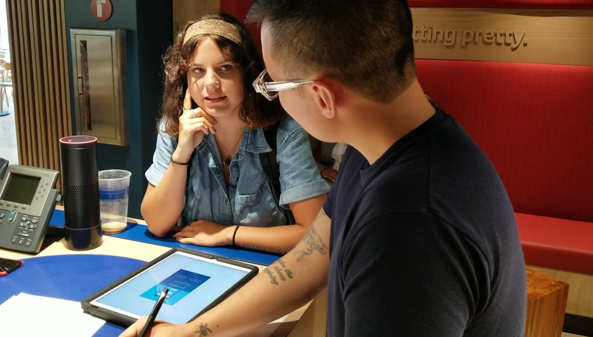
Based on the data we had from Google Analytics, I interview and tested with our customers at the café in several locations to learn about the customer's behavior.
I worked with the product manager to set up the timeline and ensure the deliverable lists aligned with our mission and business goals.
My responsibility was to iterate on the designs and prototypes quickly each time we met with a customer to make the testing process faster and more efficient.
The interactive capabilities of these large digital displays are not obvious to most so customers never get a chance to learn about the content before they touch the screen
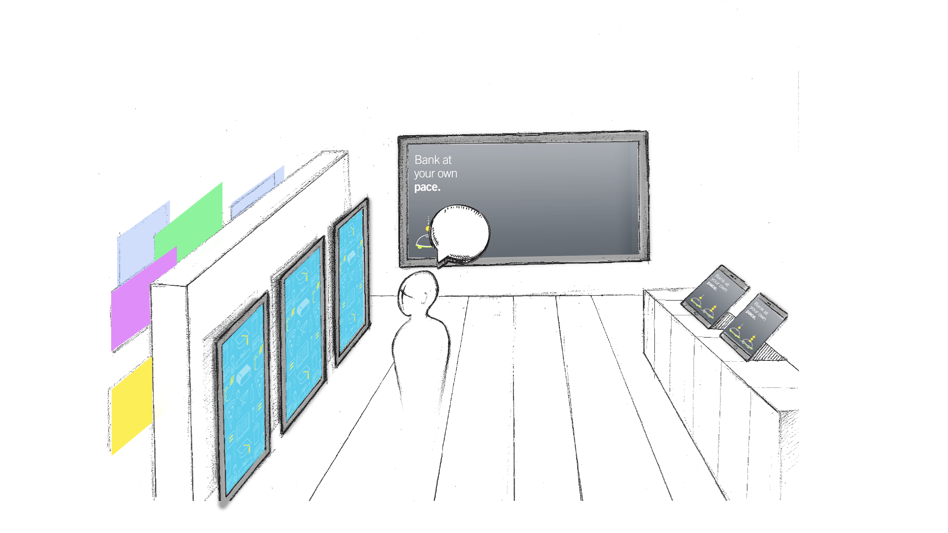
While some are surprised or even delighted to learn that these screens are touch-activated, the large public display of potentially sensitive information about financial behavior (assumed) precludes most from considering their use.
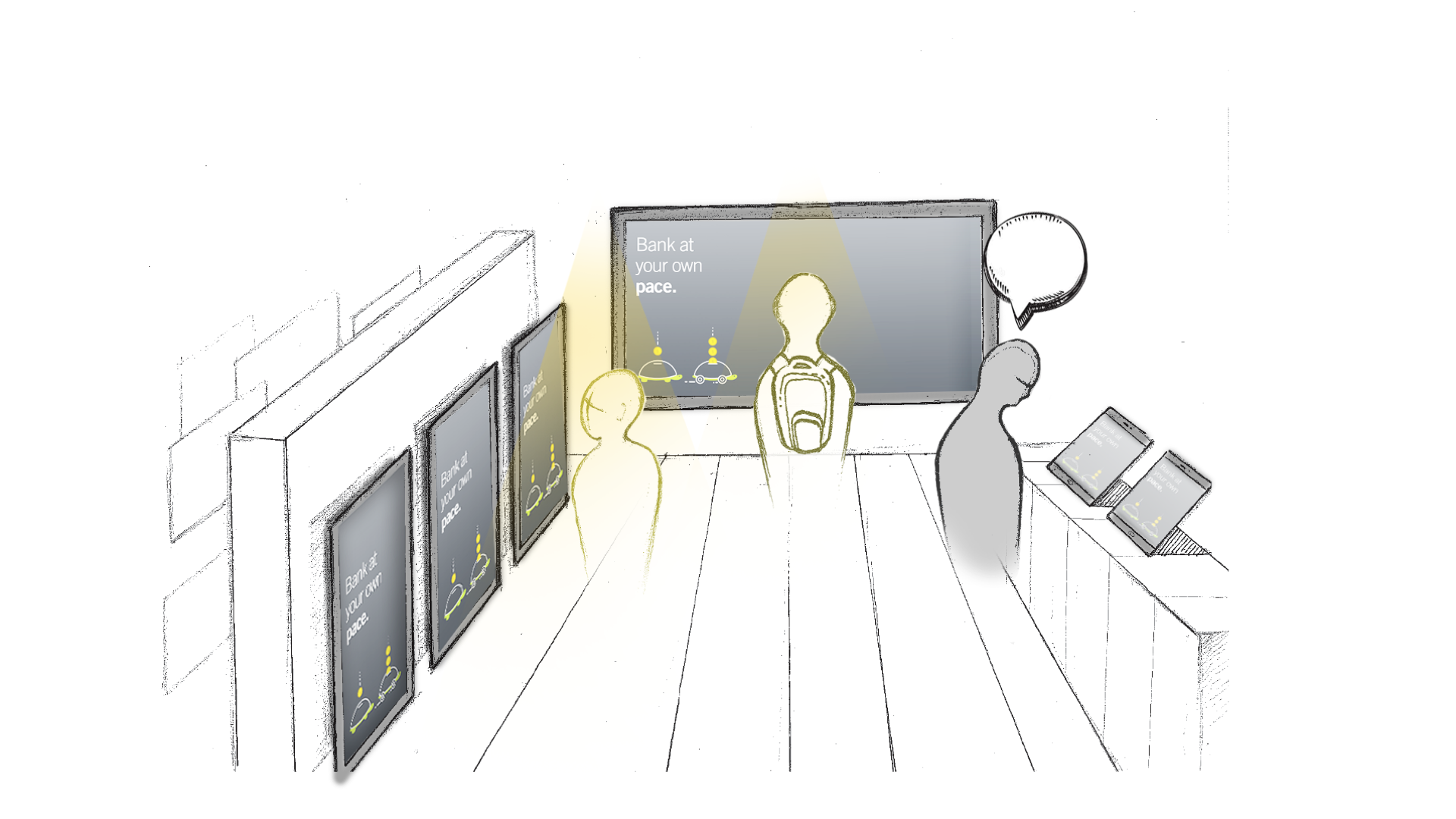
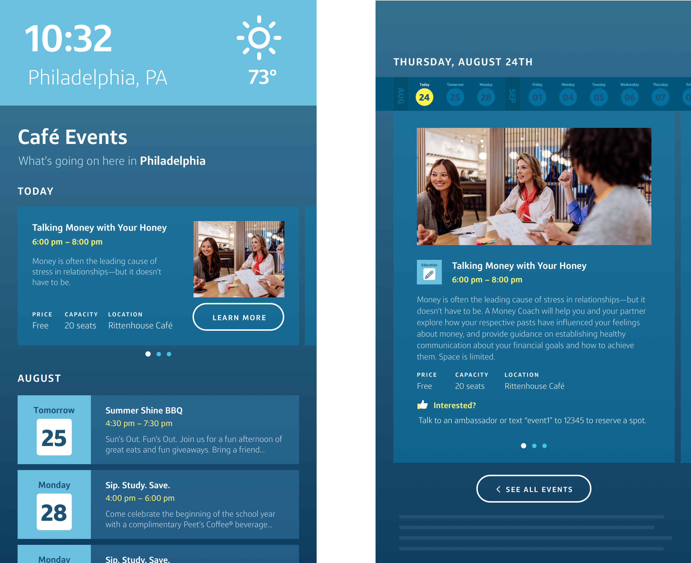
Our design goal was to make the screen clickable and enjoyable for every content piece. We have many different pieces of content that we display on the screen, but we had to pick one to test the product. Since the event calendar product had the least interaction from customers, we decided to prioritize the event calendar information to see if that triggered improvements in the engagement of the rest of the Explore screen content. We also wanted to test new content pieces for the marketing page.
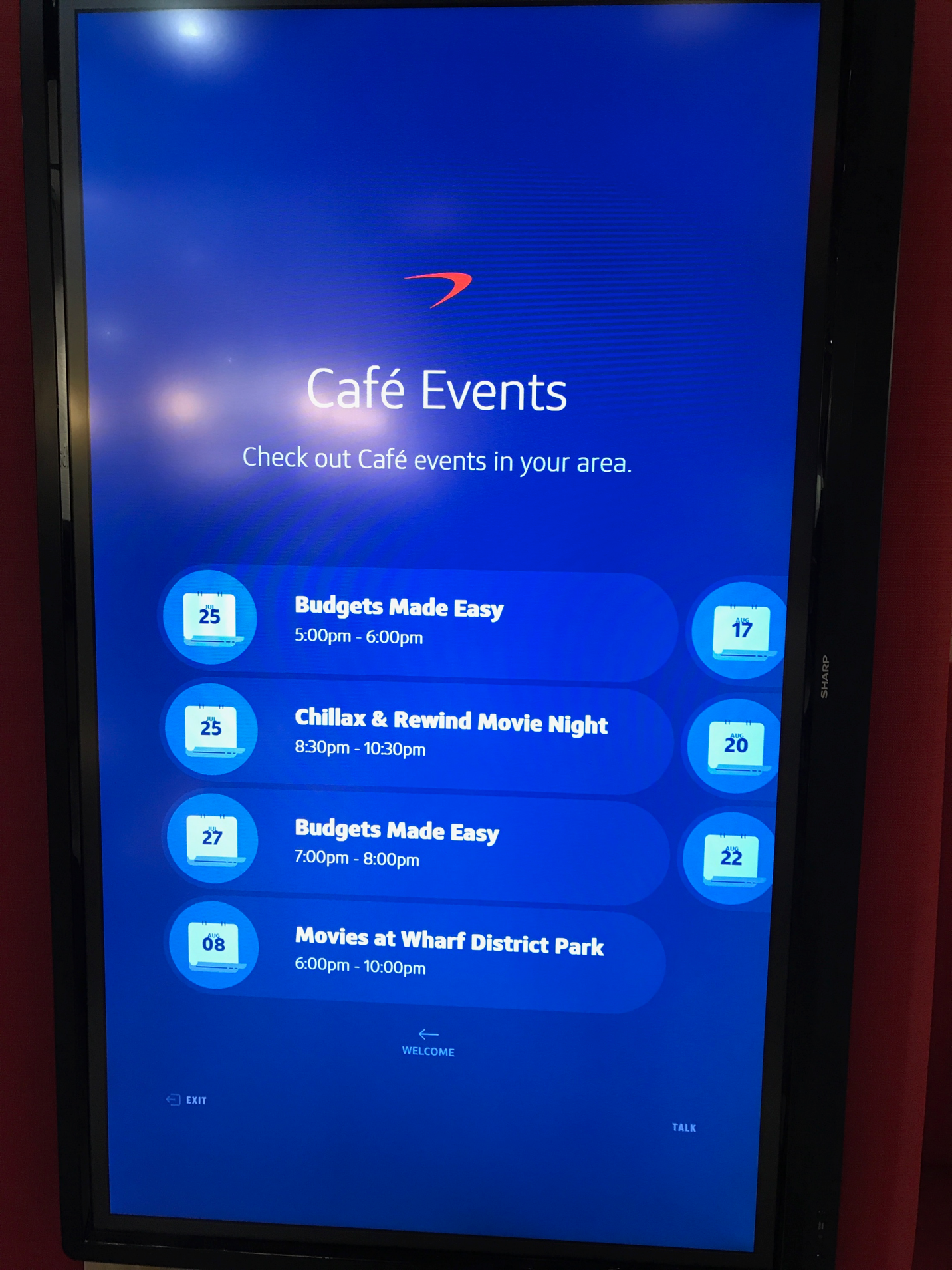
This is the event screen that had the lowest number of interaction from our users. As we see, it's text heavy, not intractable and doesn't display much information. Also, it's hard to know when events are happening.
This is the event screen that had the lowest number of interaction from our users. As we see, it's text heavy, not intractable and doesn't display much information. Also, it's hard to know when events are happening.
1.Being able to scan the screens quickly
2.Clear CTAs
3.Valuable information
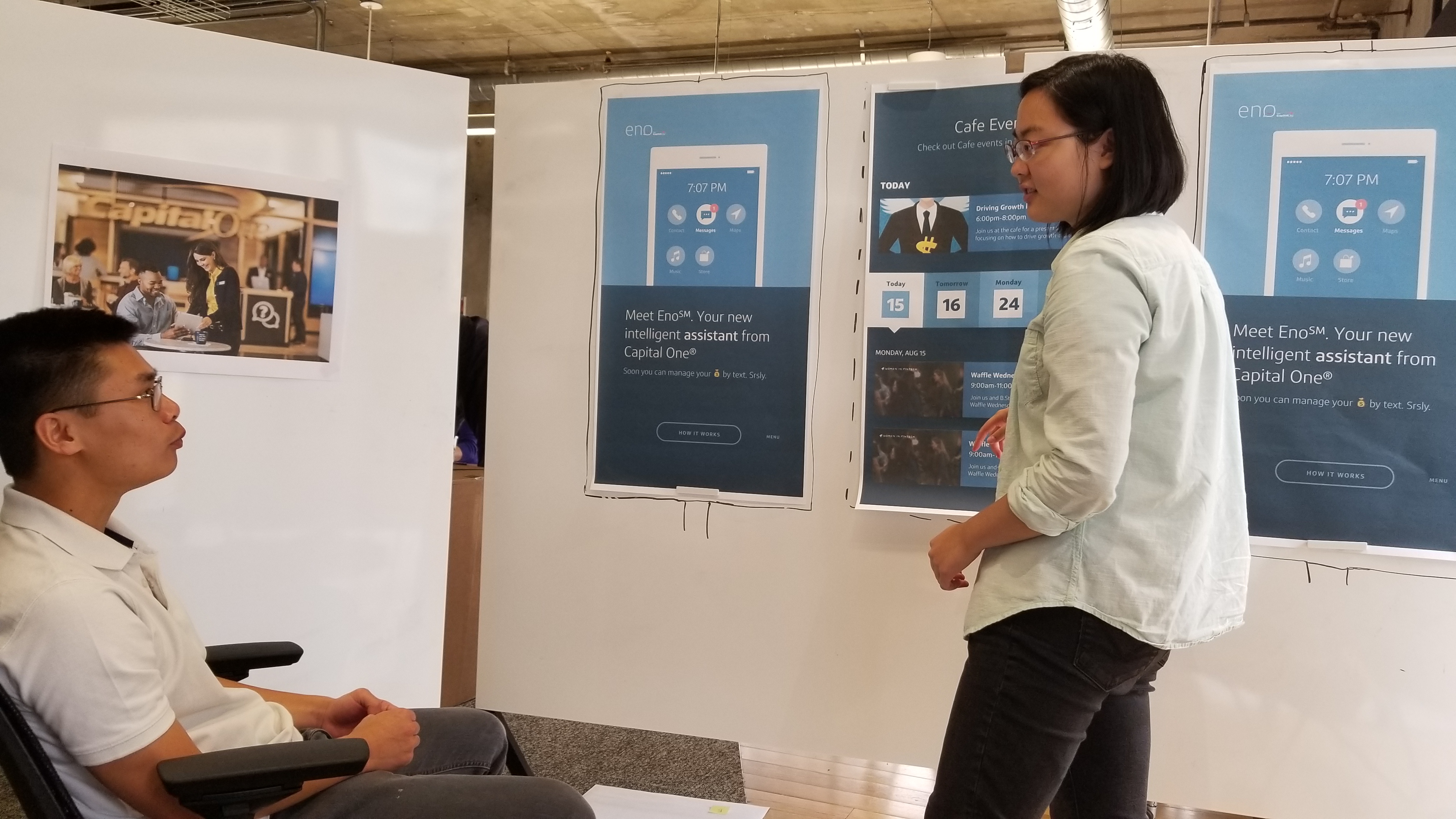
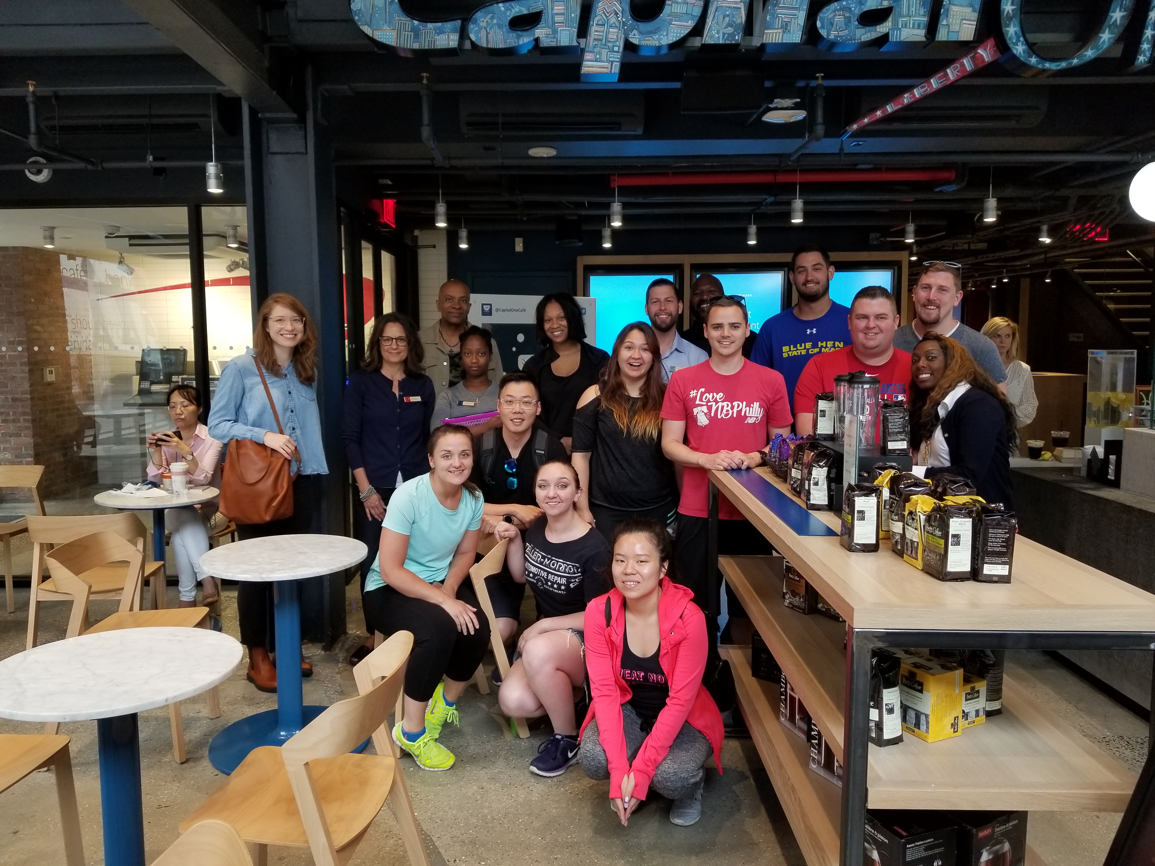
Getting feedback and validating the solution. In order to validating the solution, we went to Capital One cafés in LA, Denver, Boulder, and Walnut Creek to do user testing.
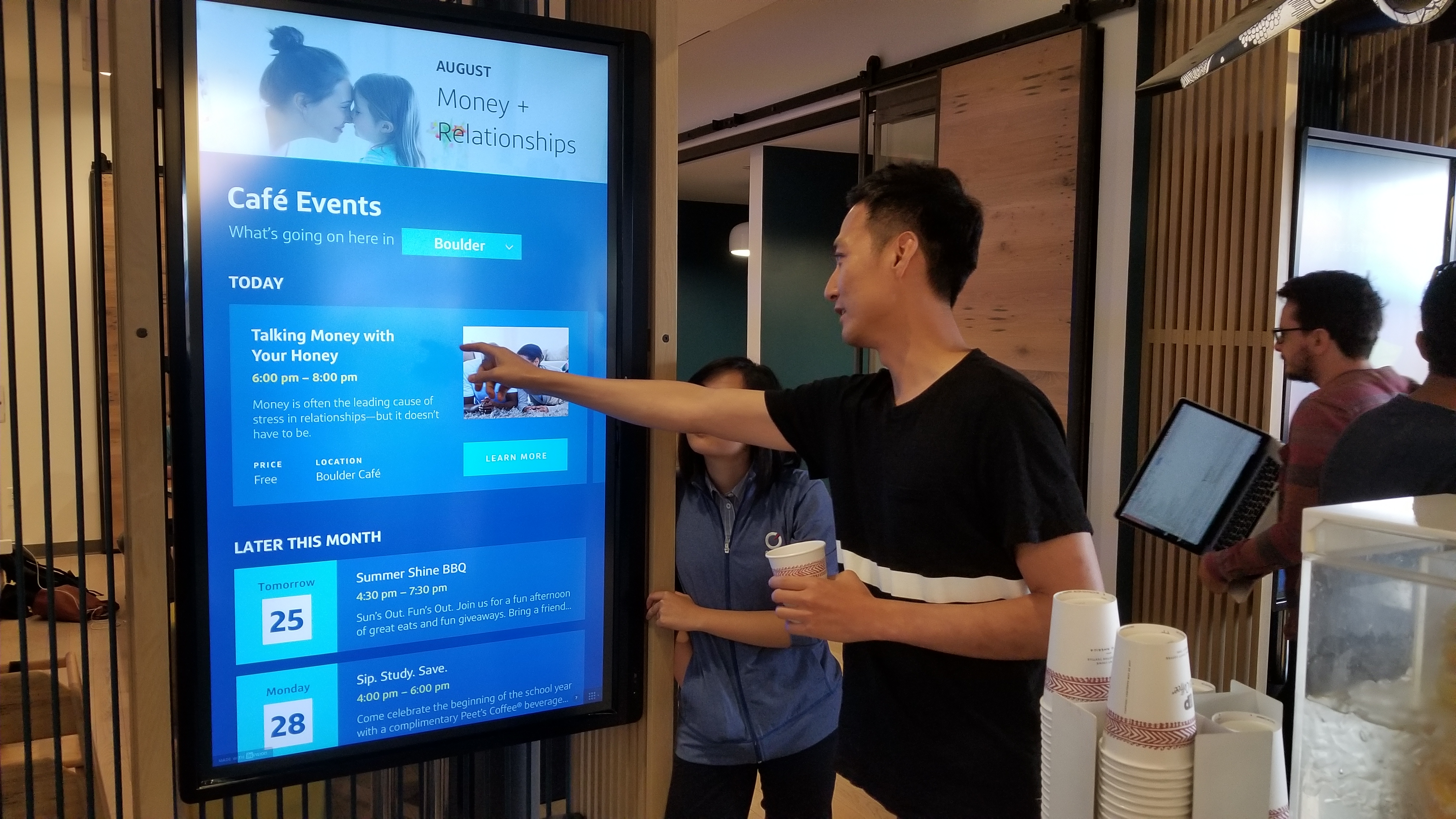
We successfully rolled out the testing with great feedback and after a few rounds of iteration, we ended up doing a 2-month long beta launch to track the change in user engagement.
During the 2-month-long beta test, the calendar's touch events increased by up to 230%(top 1). Now, we are applying same logic and strategy to the rest of the Explore screen content. Our team, and more importantly our customer, are much more satisfied with the event calendar with our newly implemented interaction and flow. Huge success!!
Because of the confidential nature of the work, I can't publicly share artifacts from my design process, but I'd be happy to show them to you in person if you'd like.
Feel free to reach out.